
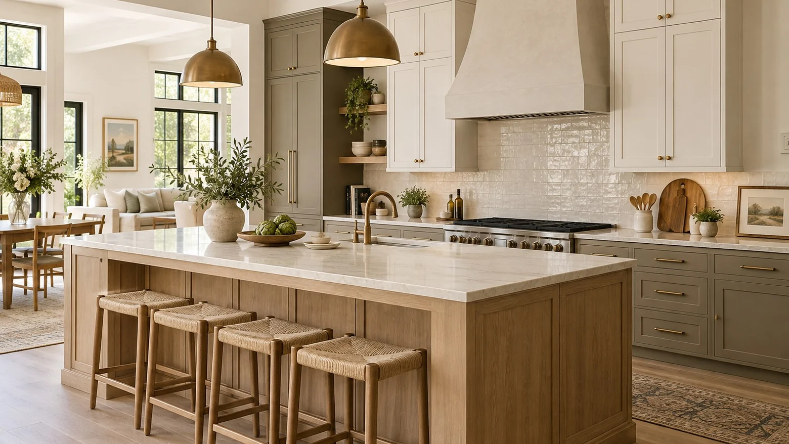
Best Kitchen Cabinet Colors for a Warm Modern American Home
Cabinet color is one of the first things people notice in a kitchen, but it should not be chosen as a paint chip in isolation. In an American home, the best kitchen cabinet color has to work with natural light, wood floors, stone or quartz countertops, hardware, appliances, and the rooms connected to the kitchen.
A warm modern kitchen should feel clean without becoming cold. It should be current without feeling trendy for only one season. For most homes, that means using softer whites, natural woods, warm grays, taupes, muted greens, deep charcoal, or a controlled two-tone palette rather than a very sharp white or a loud color that is hard to live with every day.
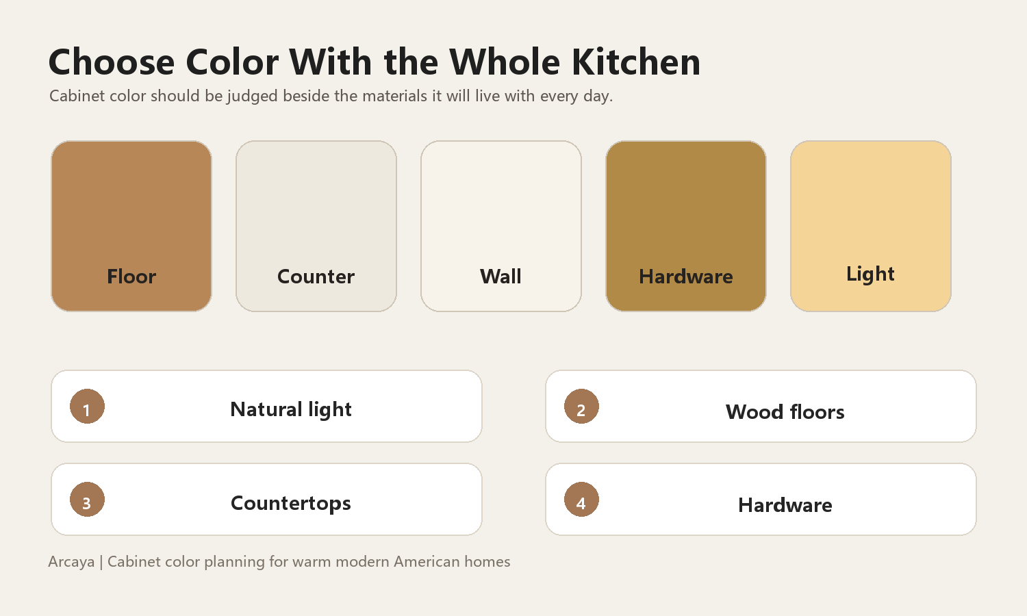
Start With Light, Flooring, and Countertops
Before choosing a cabinet color, look at the kitchen as a whole. A color that looks beautiful on a sample door may change completely next to warm oak floors, cool gray tile, a creamy quartz slab, or a bright white backsplash. Natural light also matters. A north-facing kitchen can make cool colors feel flat, while a sunny kitchen can make warm whites and wood tones look richer.
For many American homes, especially open-plan houses, the kitchen is visible from the family room, dining area, or entry. The cabinet color should not fight the rest of the home. If the living room has warm wood, woven textures, brass, soft beige, or off-white upholstery, the kitchen should usually stay in that same warm family instead of switching to a cold blue-gray or stark white.
The safest order is to compare the cabinet sample with the floor, countertop, backsplash, and hardware at the same time. This prevents the common mistake of choosing a cabinet color that looks good alone but feels wrong once the entire kitchen is installed.
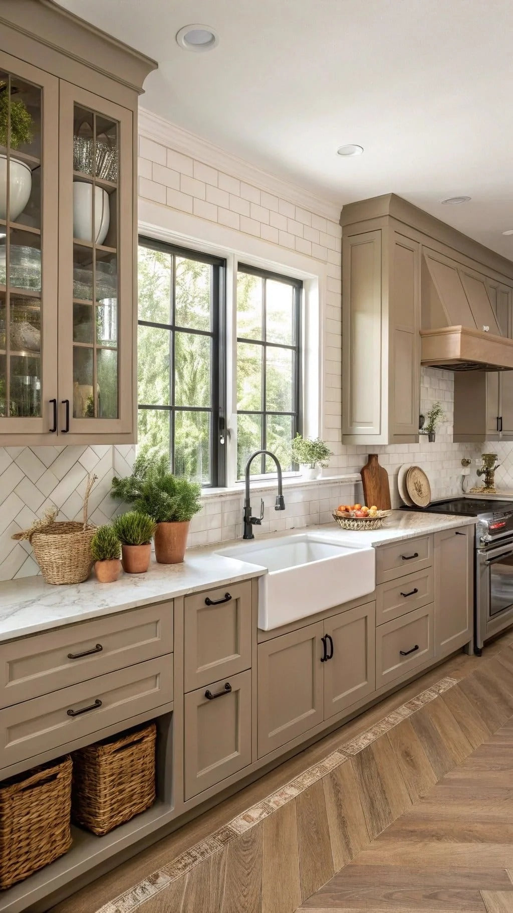
Warm White Cabinets
Warm white is still one of the most useful cabinet colors for American kitchens. It works well with Shaker doors, transitional homes, farmhouse-inspired spaces, and bright modern kitchens. The key is to avoid a cold, blue-based white unless the rest of the house is also very cool and crisp.
A better choice is often a soft white, ivory white, or creamy white. These colors make the kitchen feel bright, but they sit more naturally beside wood floors, brass hardware, woven counter stools, and warm stone veining. Warm white cabinets also give homeowners more flexibility when changing lighting, stools, decor, and wall color later.
The watch-out is flatness. If every surface is plain white, the kitchen can feel unfinished. Warm white cabinets usually look best with texture: a stone countertop, a handmade-style tile, black or brass hardware, a wood island, or layered lighting under the upper cabinets.
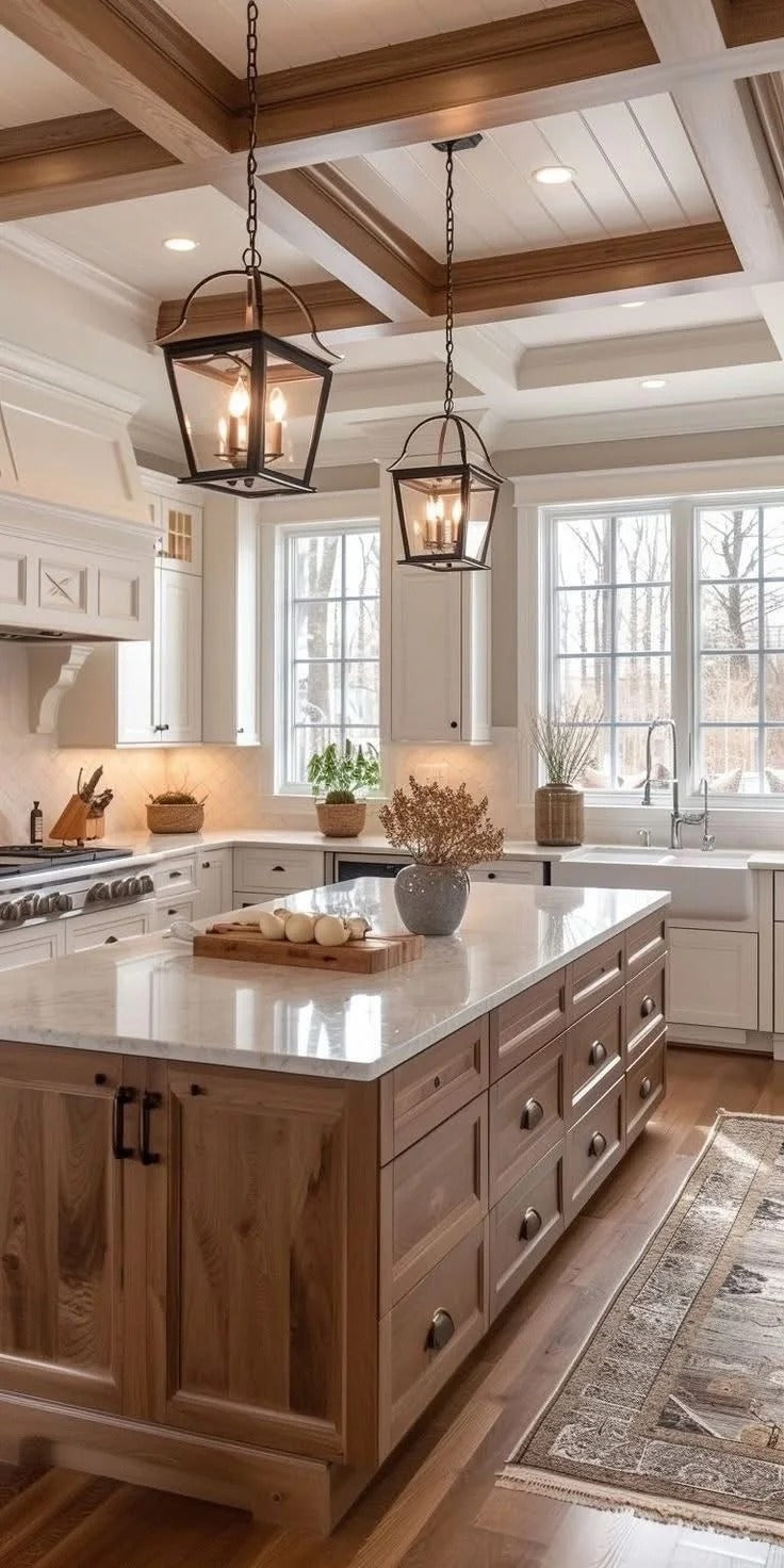
Natural Oak and Light Wood Cabinets
Natural wood cabinets are one of the strongest choices for a warm modern kitchen. Light oak, white oak, and soft natural wood finishes bring warmth without making the kitchen feel heavy. They work especially well in homes with wide plank floors, large windows, open dining areas, and a relaxed California or organic modern style.
Wood cabinets are also good for families who want the kitchen to feel less formal than an all-white kitchen. The grain adds movement, so the room can feel designed even when the palette is quiet. A light wood cabinet can pair beautifully with white quartz, warm stone, handmade tile, matte black hardware, or brushed brass.
The main risk is choosing a wood tone that is too yellow, too orange, or too rustic for the rest of the house. In a warm modern American home, the most flexible wood tones are usually muted, natural, and slightly neutral. If the floor is also wood, the cabinet finish does not need to match exactly, but it should feel intentional beside it.

Taupe, Greige, and Warm Gray Cabinets
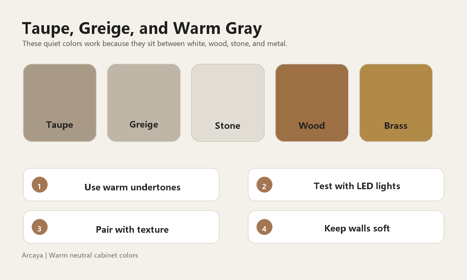
Taupe, greige, and warm gray are often more livable than pure gray. They have enough warmth to work with wood flooring, but enough softness to feel modern. These colors are useful for homeowners who want something quieter than green or black, but less predictable than white.
A taupe cabinet can make a kitchen feel calm and expensive when paired with cream walls, black window frames, marble-look quartz, aged brass hardware, or natural wood. It also performs well in larger kitchens where white cabinetry might feel too empty across a long wall of cabinets.
The important detail is undertone. Some grays turn blue or purple under cool LED lighting. For a warm modern kitchen, test the sample in the actual room during the morning, afternoon, and evening. A good warm gray should still feel soft after sunset, not cold or muddy.
Soft Green and Muted Earth Tones
Soft green, sage, olive, mushroom, and muted earth tones can make a kitchen feel personal without becoming loud. These colors are especially effective when the home already includes plants, natural stone, wood beams, rattan stools, or warm metal finishes.
For many homeowners, green is easier to live with when it is slightly gray, slightly brown, or used on lower cabinets instead of every cabinet surface. A creamy upper cabinet with a soft green base cabinet can feel warm, fresh, and grounded at the same time.
Muted color works best when the rest of the palette stays disciplined. If the cabinets are green, keep the countertop, backsplash, and wall color simple. Too many competing surfaces will make the kitchen look busy, even if each item is beautiful on its own.

Black and Deep Charcoal Cabinets
Black, espresso, and deep charcoal cabinets can look excellent in the right American home, especially when the kitchen has enough natural light, warm wood flooring, and strong architectural details. They can create a polished, quiet luxury feeling without using many decorative elements.
The best dark kitchens usually include contrast and warmth. Brass or bronze hardware, wood shelves, warm stone, white tile, and good lighting keep the space from feeling flat. A dark island with lighter perimeter cabinets is also a strong option for homeowners who want depth without committing to a fully dark kitchen.
Dark cabinets do require discipline. In a small kitchen with limited daylight, they can make the room feel narrower. They can also show dust, fingerprints, or water marks depending on the finish. For daily use, a satin or soft matte finish is often easier to live with than a very glossy surface.

Two Tone Cabinets
Two-tone cabinets are useful when the kitchen needs depth but the homeowner still wants the room to feel bright. A common approach is light upper cabinets and darker lower cabinets. The upper cabinets keep the wall light, while the base cabinets hide daily wear better and visually anchor the room.
Popular warm modern combinations include warm white with natural oak, cream with taupe, soft white with sage green, or white perimeter cabinets with a wood or charcoal island. In open kitchens, the island can act like a furniture piece that connects the kitchen to the dining or family room.
The rule is restraint. Two cabinet colors are usually enough. If the kitchen also has a patterned backsplash, strong countertop veining, visible appliances, and a different floor tone, adding a third cabinet color can quickly make the space feel fragmented.

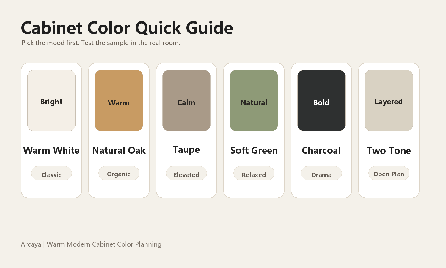
Cabinet Color Quick Guide
The best color depends less on what is trending and more on what the house needs. A resale-focused suburban kitchen may call for warm white or greige. A new-build house with open living space may benefit from wood or two-tone cabinets. A larger custom home with strong light can handle deeper charcoal or black.
Cabinet Color Comparison
| Color family | Best for | Works well with | Watch out |
|---|---|---|---|
| Warm white | Transitional homes, resale-friendly kitchens | Stone-look quartz, brass, black hardware, wood floors | Too much plain white can feel flat |
| Natural oak | Open kitchens, organic modern homes | White counters, handmade tile, matte black or brass | Avoid orange or overly rustic tones |
| Taupe or greige | Large kitchens, warm modern palettes | Cream walls, black windows, warm stone | Cool lighting can change undertones |
| Soft green | Relaxed kitchens with natural materials | Cream upper cabinets, wood, simple tile | Keep surrounding finishes quiet |
| Charcoal or black | Sunny kitchens with architectural strength | Wood, brass, white tile, strong lighting | Can feel heavy in small dark kitchens |
| Two-tone | Open kitchens and islands | Light uppers, deeper lowers, wood island | Limit the palette to two cabinet colors |
Colors to Be Careful With
Very cool gray can make a warm home feel dated or disconnected, especially beside oak floors and cream stone. Pure bright white can look harsh if the lighting is too cool. Very yellow wood can feel old-fashioned if the rest of the kitchen is modern. Highly saturated blue, green, or trendy clay colors can be beautiful, but they are harder to coordinate and may not appeal to future buyers.
This does not mean these colors are never right. It means they need stronger design control. If a homeowner wants a bolder color, it often works better on an island, pantry wall, bar area, or furniture-style cabinet than on every cabinet in the kitchen.

How to Choose Before You Order
Always view cabinet samples vertically, because doors are seen upright, not flat on a table. Compare them against the actual countertop, backsplash, floor, wall color, and hardware. Look at the samples during the day and at night under the kitchen lighting. If the home has recessed lights, pendants, and under-cabinet lighting, check the color under all three.
It also helps to decide what should be the visual anchor. In some kitchens, the cabinets are the quiet background and the stone is the feature. In others, the island color or wood cabinetry becomes the main warmth in the room. When every surface tries to be the focus, the kitchen can feel expensive but not peaceful.
For a warm modern American home, the strongest cabinet colors are usually warm white, natural wood, taupe, greige, sage, olive, charcoal, and carefully planned two-tone combinations. They are flexible, comfortable, and easier to connect with the rest of the house.

Final Thoughts
A good cabinet color should make the kitchen feel better every day, not just look interesting in one photo. It should support the room's light, the flooring, the countertop, the hardware, and the way the family actually uses the kitchen.
For homeowners planning custom cabinetry, color should be discussed at the same time as layout, materials, door style, storage, and installation details. When those decisions are coordinated, the kitchen feels warmer, more intentional, and more valuable over time.


Cabinet Box Materials Plywood vs MDF vs Particle Board
A practical guide to cabinet box materials, comparing plywood, MDF, and particle board for custom kitchen cabinetry, with notes...

How to Choose Custom Kitchen Cabinets: Materials, Layout, Storage, and Budget
A practical Arcaya guide to choosing custom kitchen cabinets, covering kitchen layout, cabinet construction, door styles, stora...

How to Choose Custom Kitchen Cabinets
A practical factory-visit checklist for comparing plywood quality, edge banding, cabinet interiors, finish samples, and install...